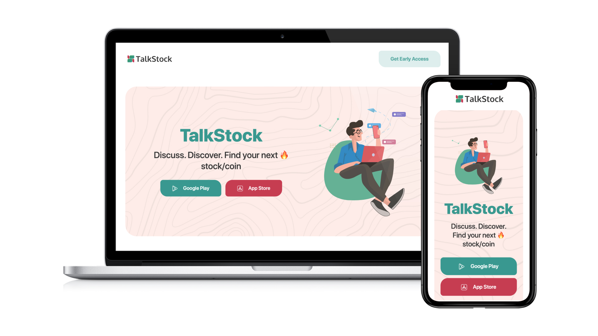
Thank you for exploring the TalkStock App case study. We appreciate your interest in our vision to connect and empower stock market enthusiasts. Your support means a lot!
TalkStock
1. Research and Discovery
1.1. Project Overview
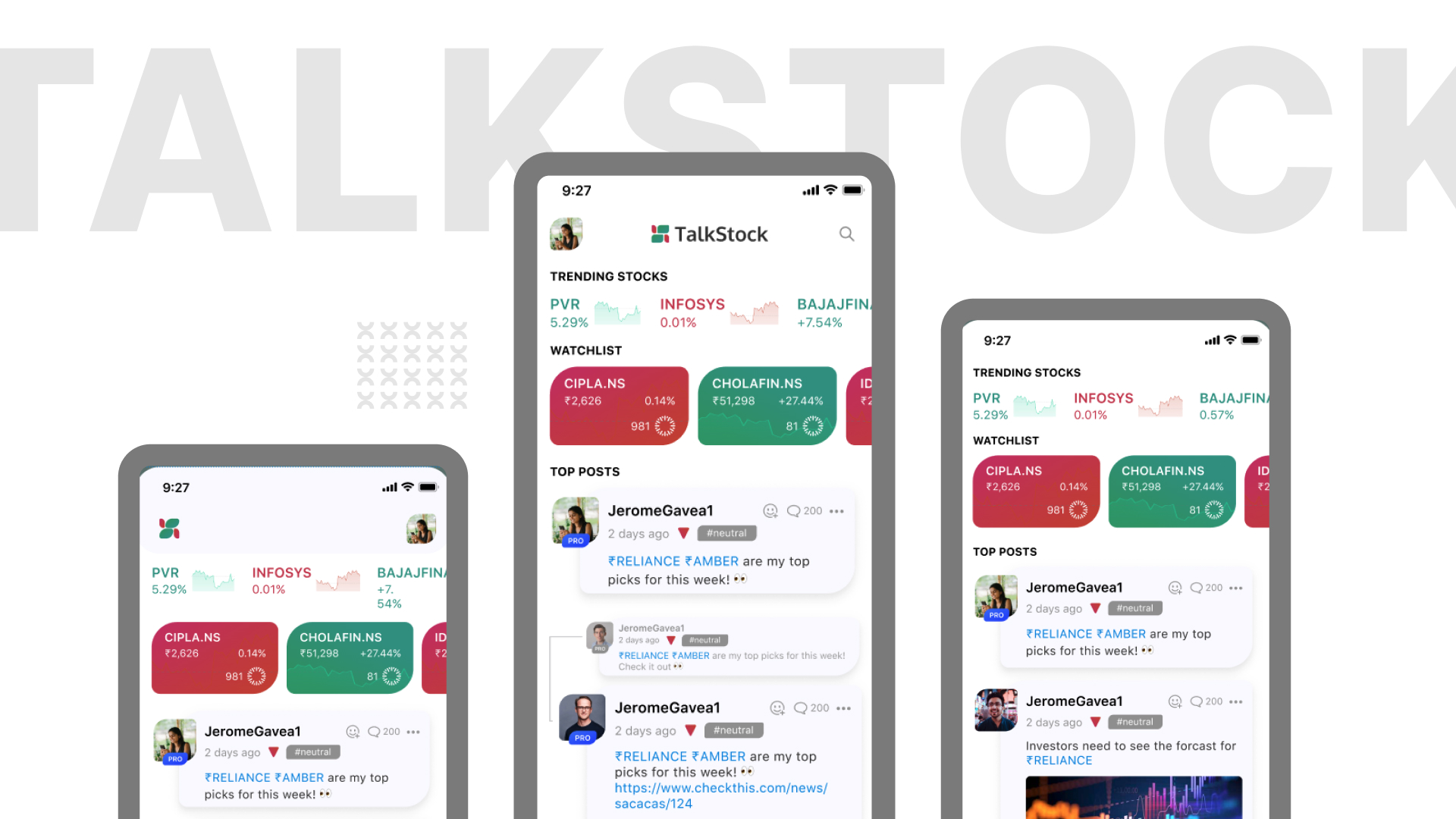
TalkStock is a social media platform for stock market enthusiasts to share insights, discuss trends, and express opinions on specific stocks. It simplifies stock-related conversations by allowing users to tag stocks in posts, categorize perspectives as bullish, bearish, or neutral, and engage in threaded discussions.
1.2. Problem Statements
- Fragmented Communication: Lack of a centralized platform for stock-specific discussions.
- Missing Community Sentiment Representation: No effective way to categorize or visualize market sentiment.
- Discovery Challenges: Difficulty finding relevant stock-related conversations.
- Low Engagement: Existing platforms lack tools for organized discussions and contributor recognition.
1.3. Solution Highlights
- Post and Tag Stocks: Users can create posts, tag specific stocks, and add their sentiment—Bull Gang, Bear Gang, or Neutral.
- Threaded Discussions: Seamless commenting system for detailed conversations.
- Personalized Feeds: Stock-tagged and sentiment-based post categorization for easy discovery.
- Community Recognition: Leaderboards and badges for top contributors.
1.4. Impact
TalkStock fosters a collaborative community, providing users with a centralized hub for actionable insights, diverse opinions, and organized discussions, empowering retail investors to make informed decisions.
2. Architecture & Wireframes
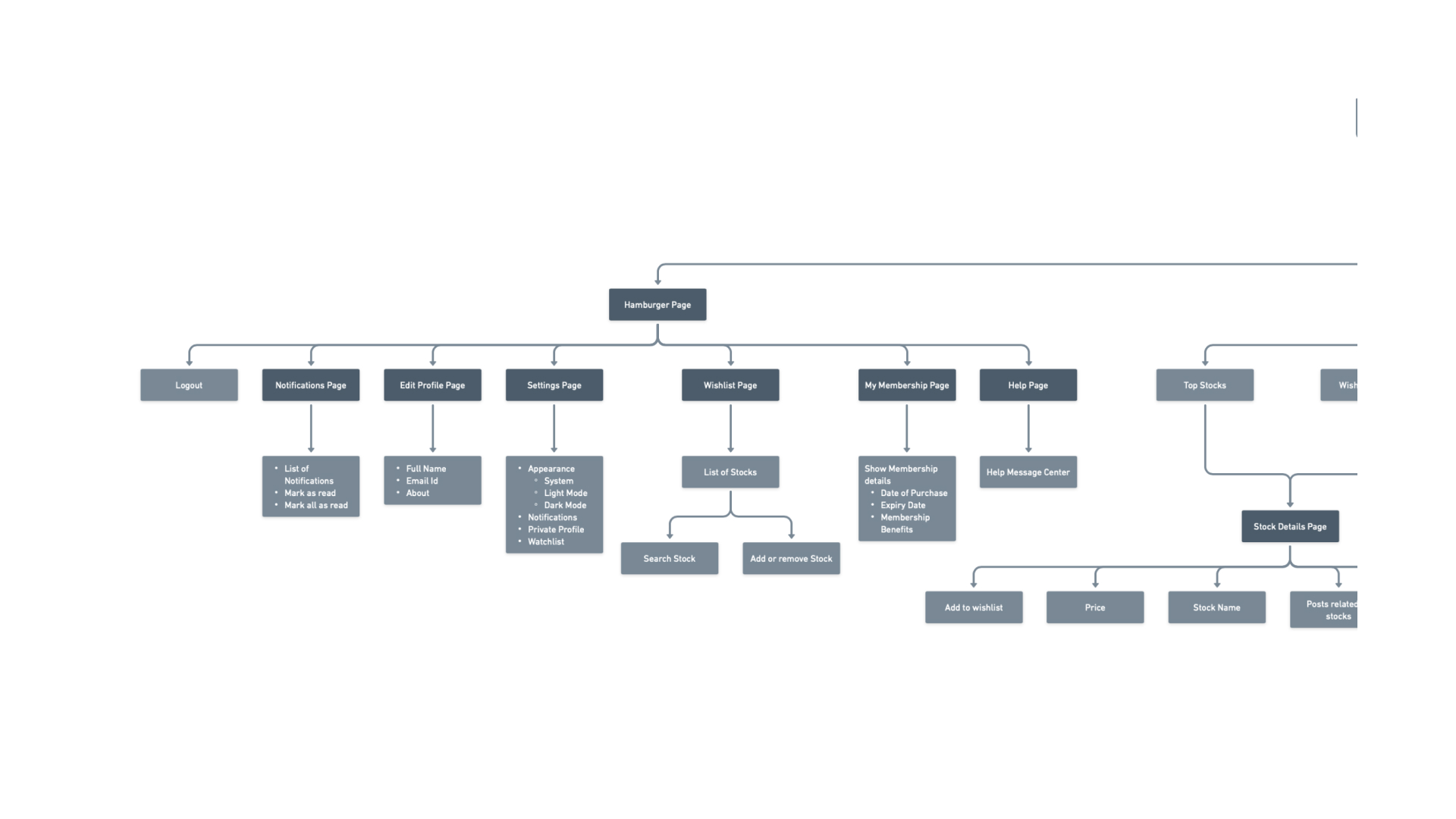
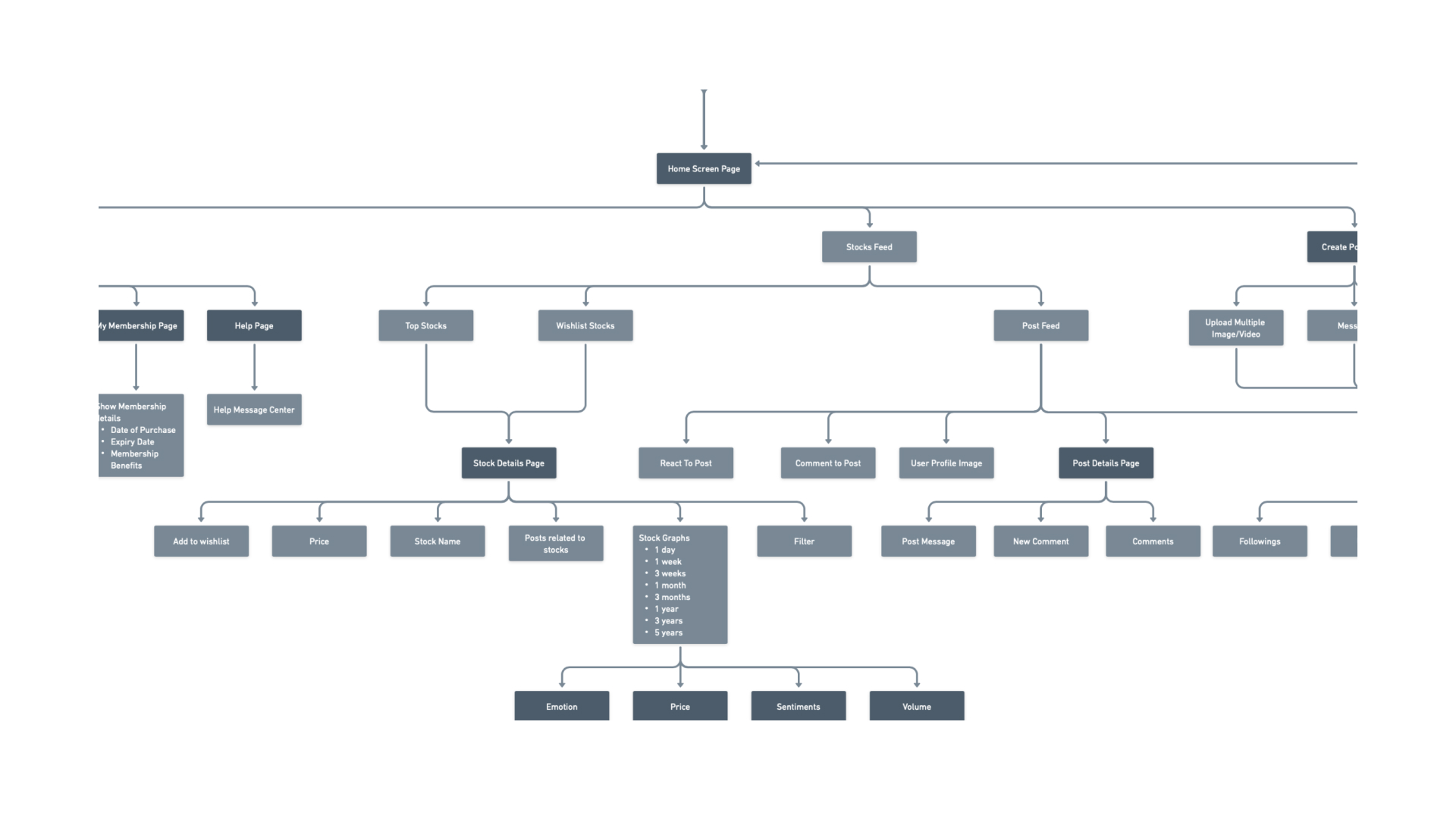
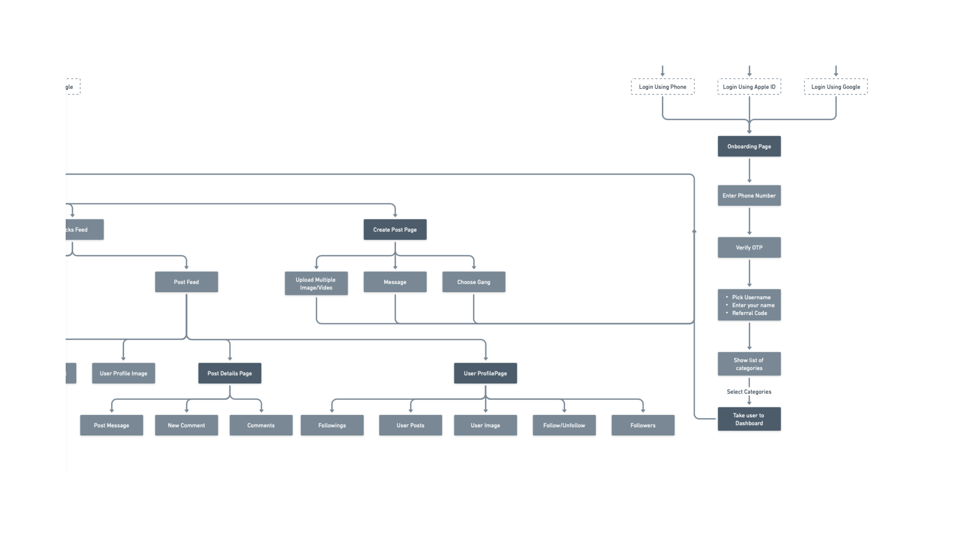
2.1. Flow Charts
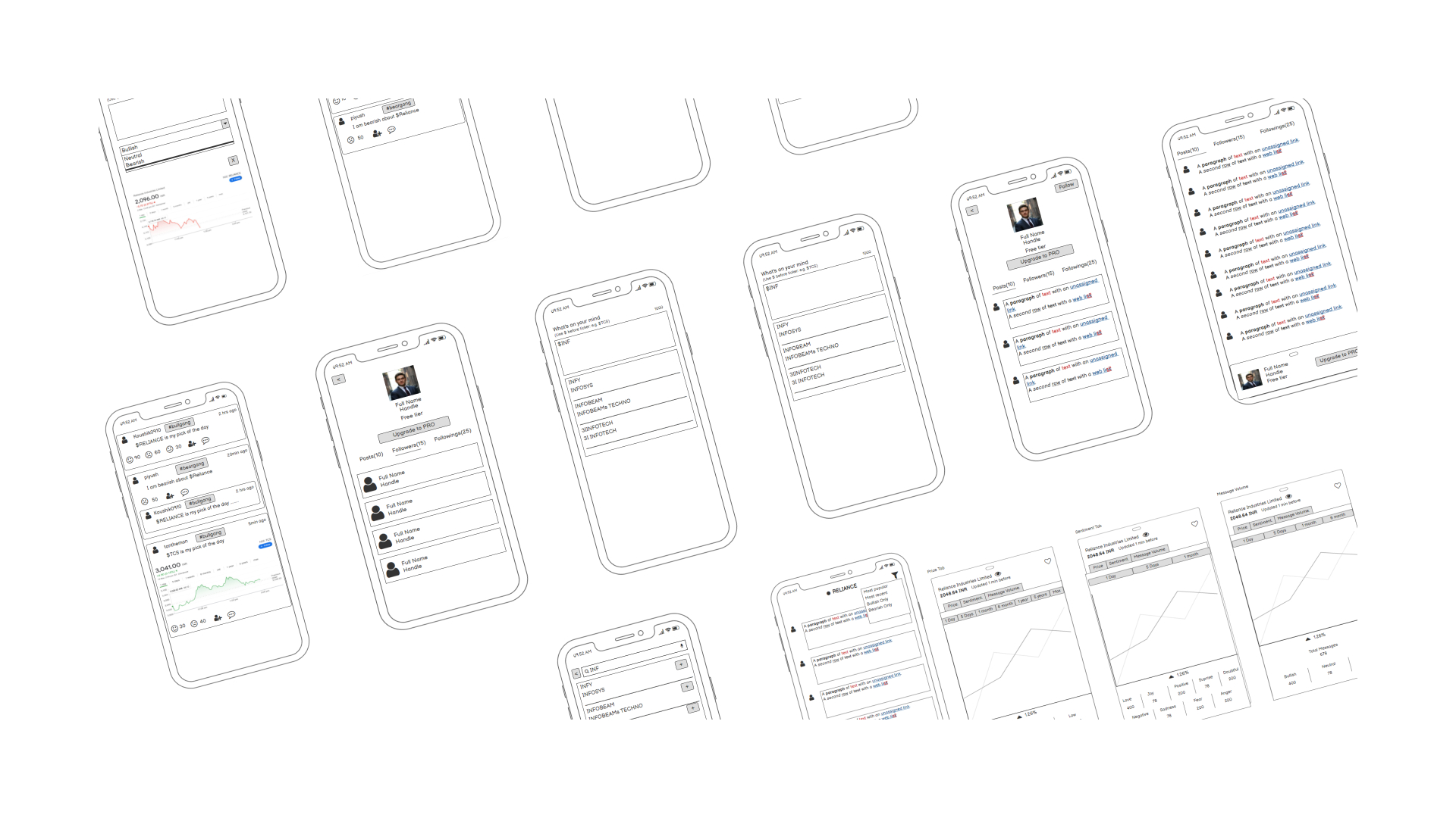
2.2. Wireframes
3. Typography and Colors
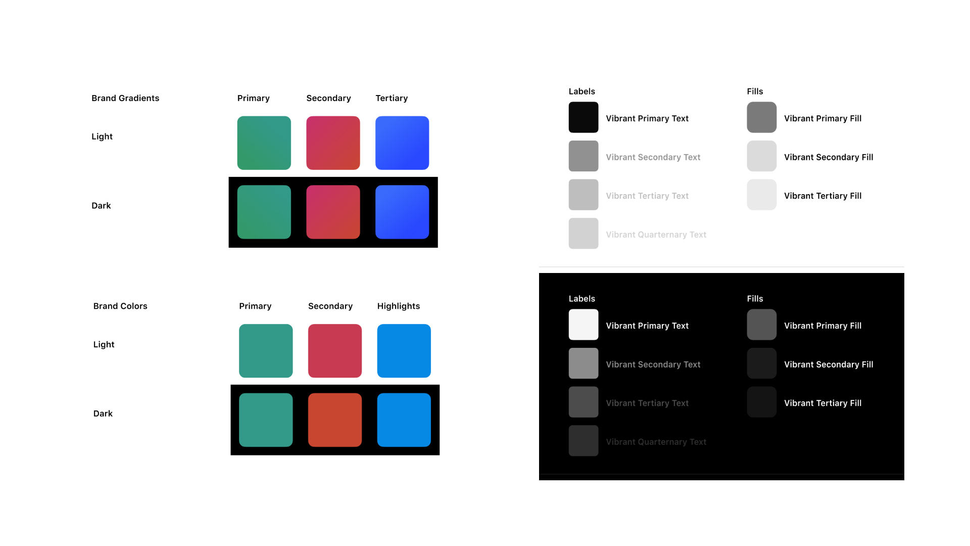
3.1. Brand Colors & Gray Swatch
These colors signify growth, volatility, and stability respectively, providing users with intuitive visual cues for market trends and sentiments.
These colors evoke confidence and clarity, aiding investors in making informed decisions swiftly and effectively.
We opted for gray swatches in both dark and light modes for our stock app to ensure readability and reduce eye strain during extended use.
This color choice offers a balanced aesthetic, enhancing the app's usability.
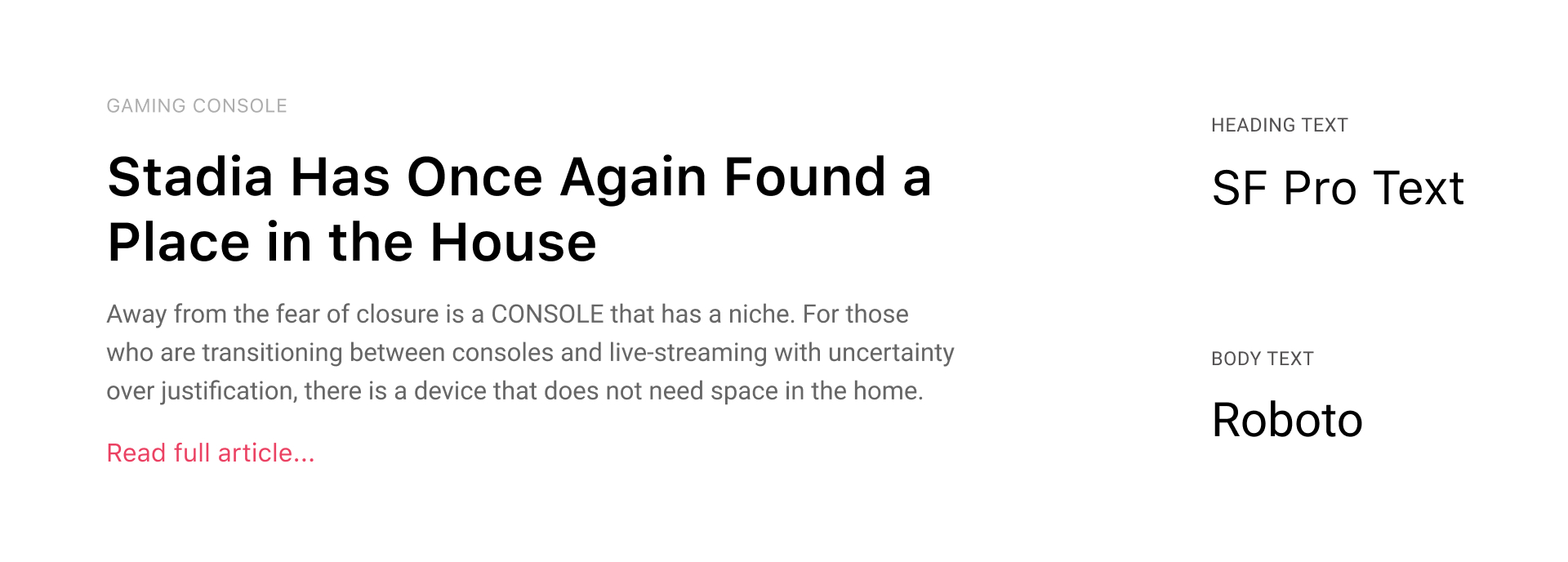
3.2. Fonts
4. Assets
4.1. Improvisation to Logo
The TalkStock logo has undergone a subtle yet impactful upgrade, with the corners of the four boxes now rounded. This simple adjustment embodies the need for adaptability and flexibility.
By incorporating this change, the logo not only maintains its symbolic representation of market movements but also evolves to resonate with the ever-changing landscape of finance.
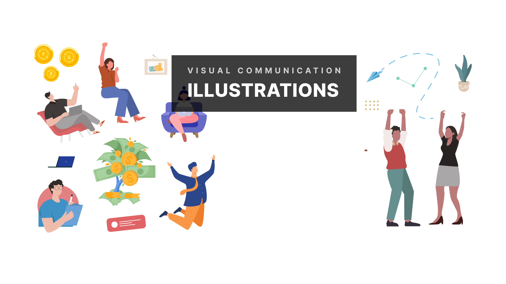
4.2. Illustrations
These are designed to enhance user experience. From welcoming screens to informative guides, our illustrations bring our app to life with vibrant colors, engaging characters, and captivating scenes.
4.3. Avatars for Profile Picture
These vibrant and diverse avatars are designed to add a splash of personality to profile. With a range of colors, styles, and expressions, there's an avatar to suit every user.
4.4. Icons
4.5. Components
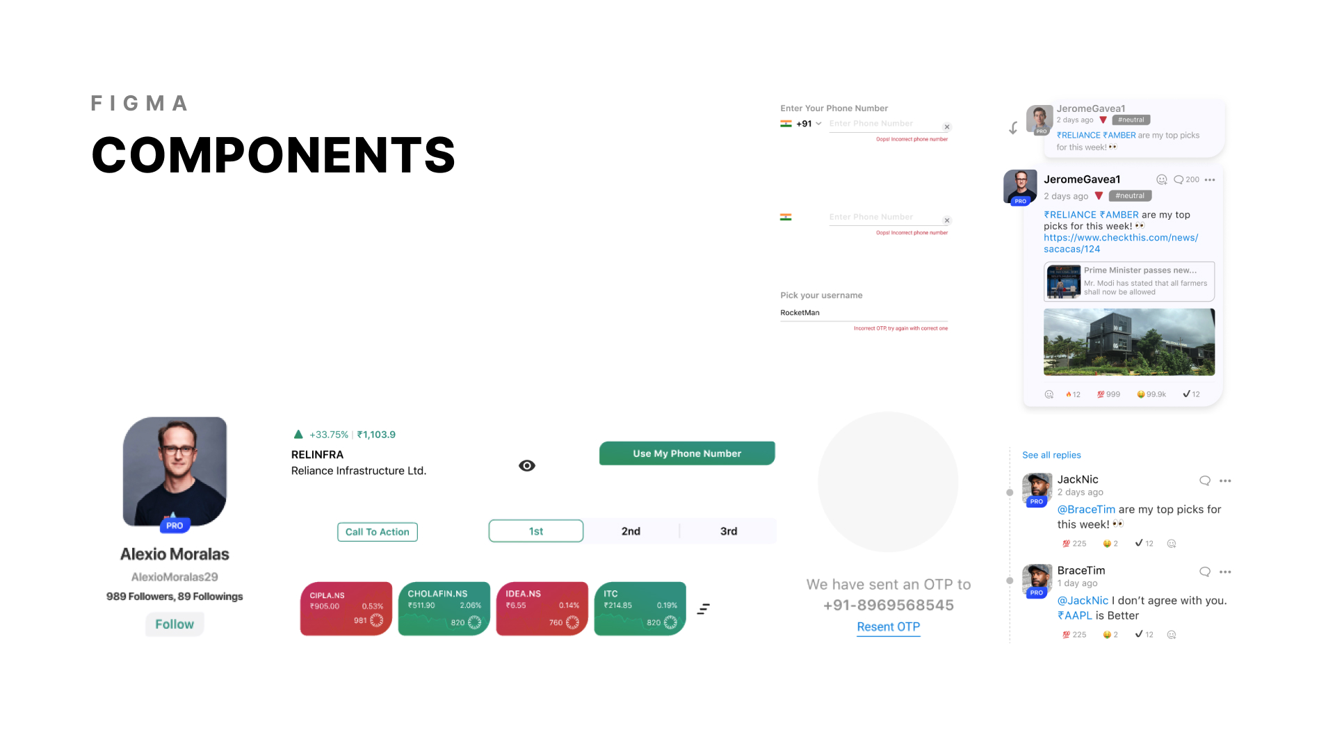
These user-friendly components ensures a seamless experience with their consistent look and feel, making every feature simple to locate and utilize.
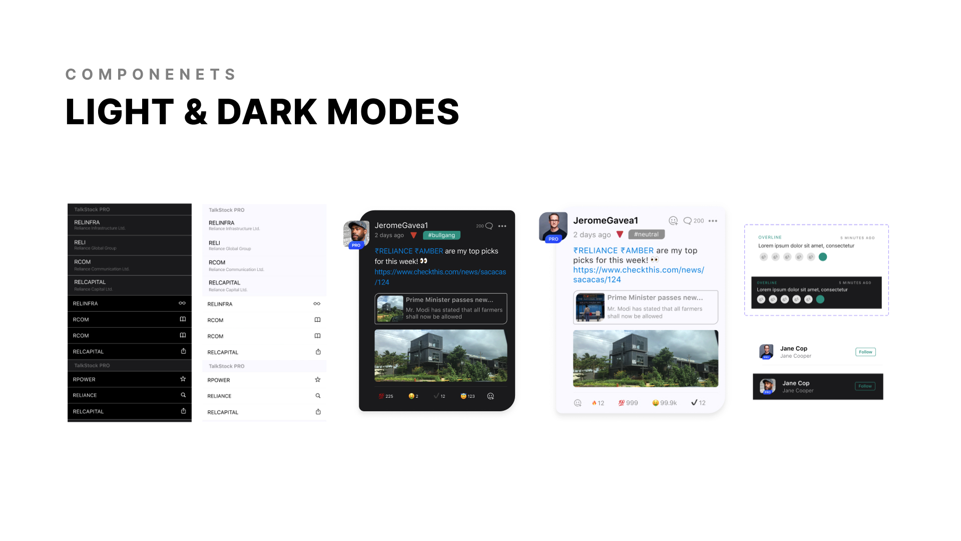
These components are optimized for both light and dark modes, ensuring effortless and intuitive navigation for all users.
5. Visual Design
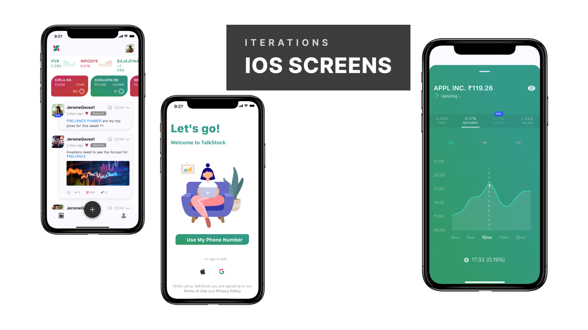
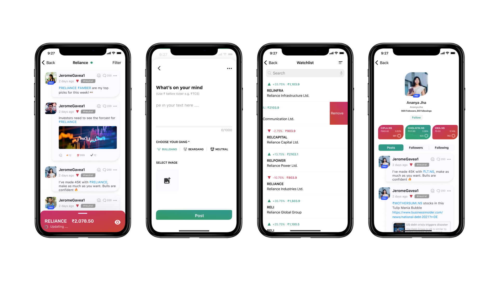
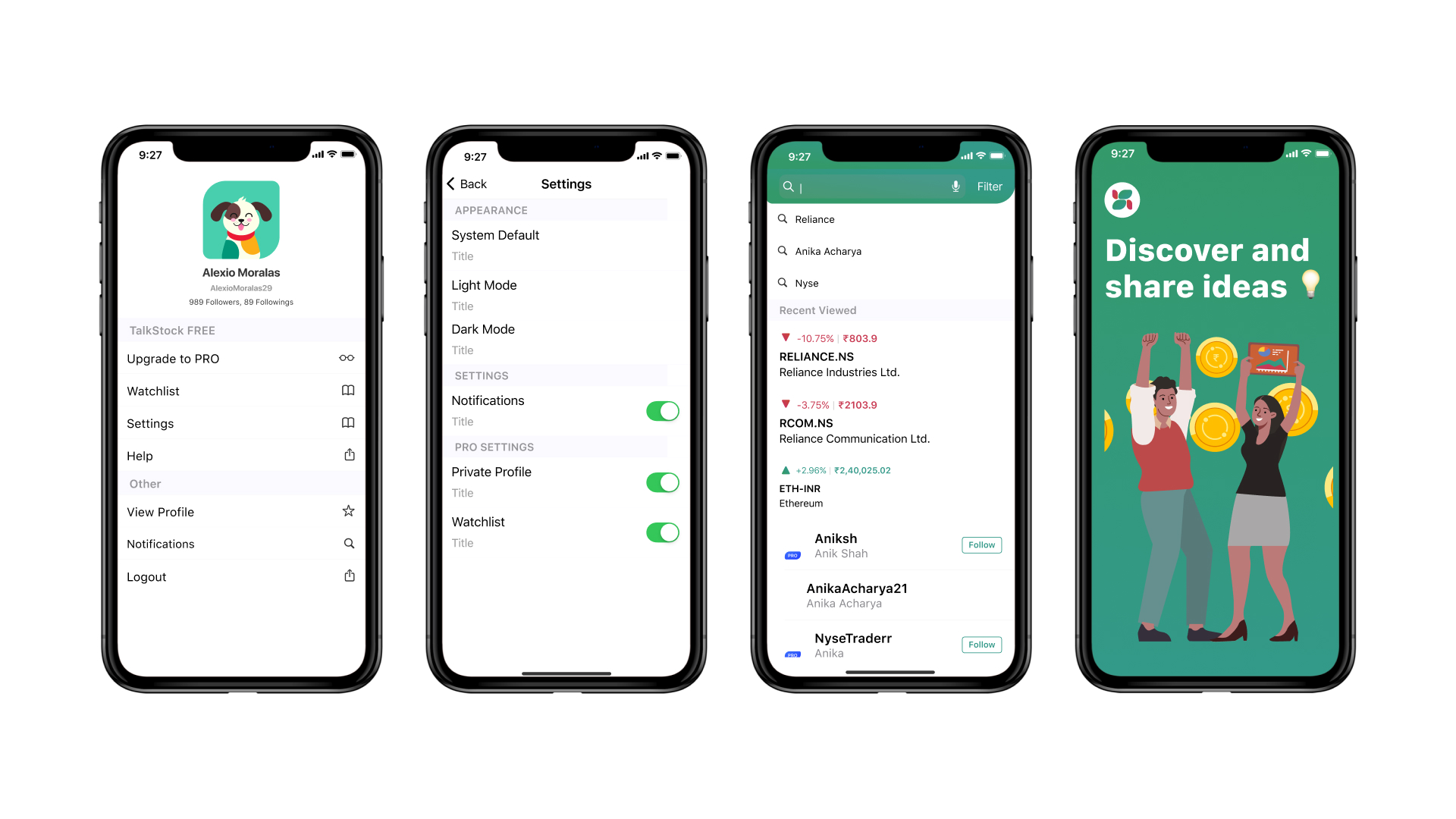
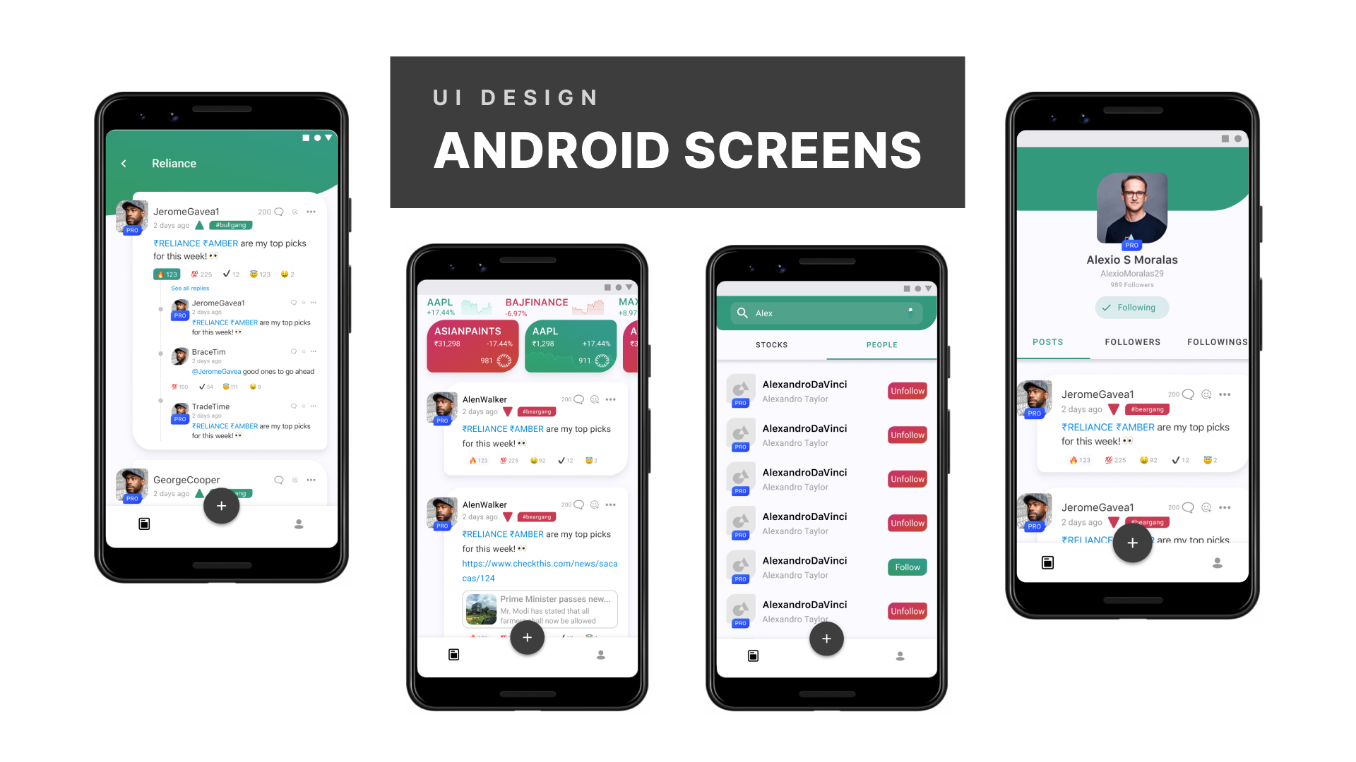
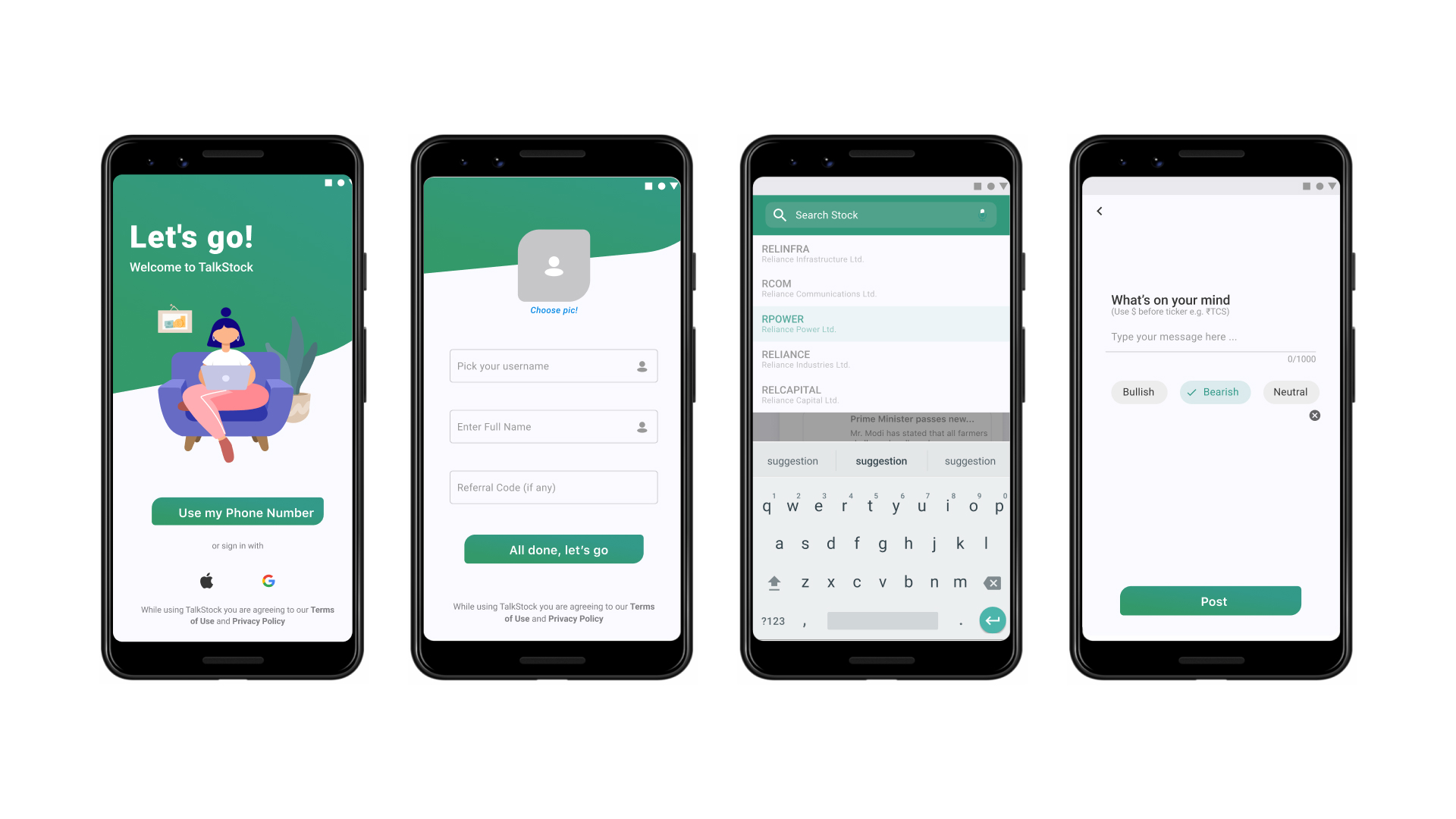
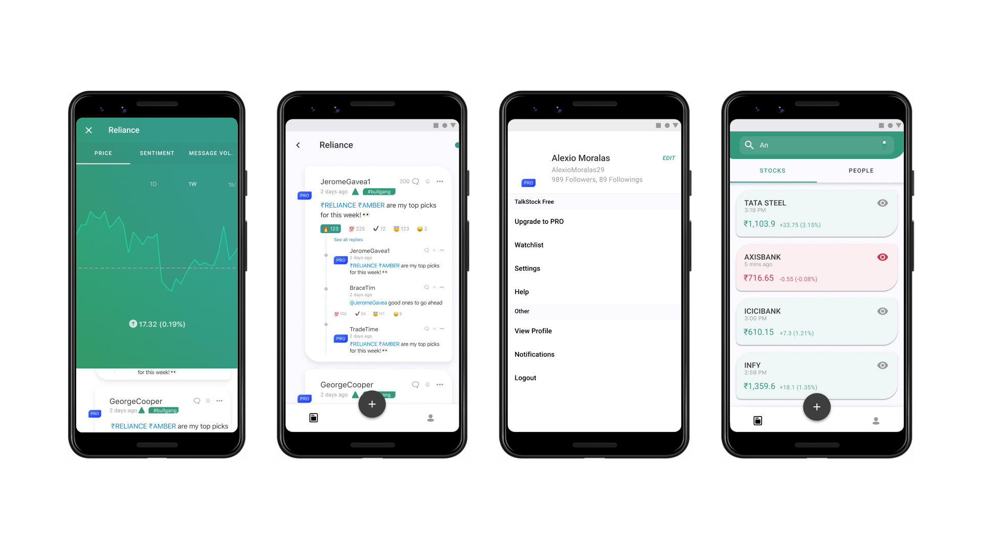
Various designs were crafted for easy navigation and dynamic data visualization, prioritizing user experience without compromising on simplicity or comprehensive information display.


